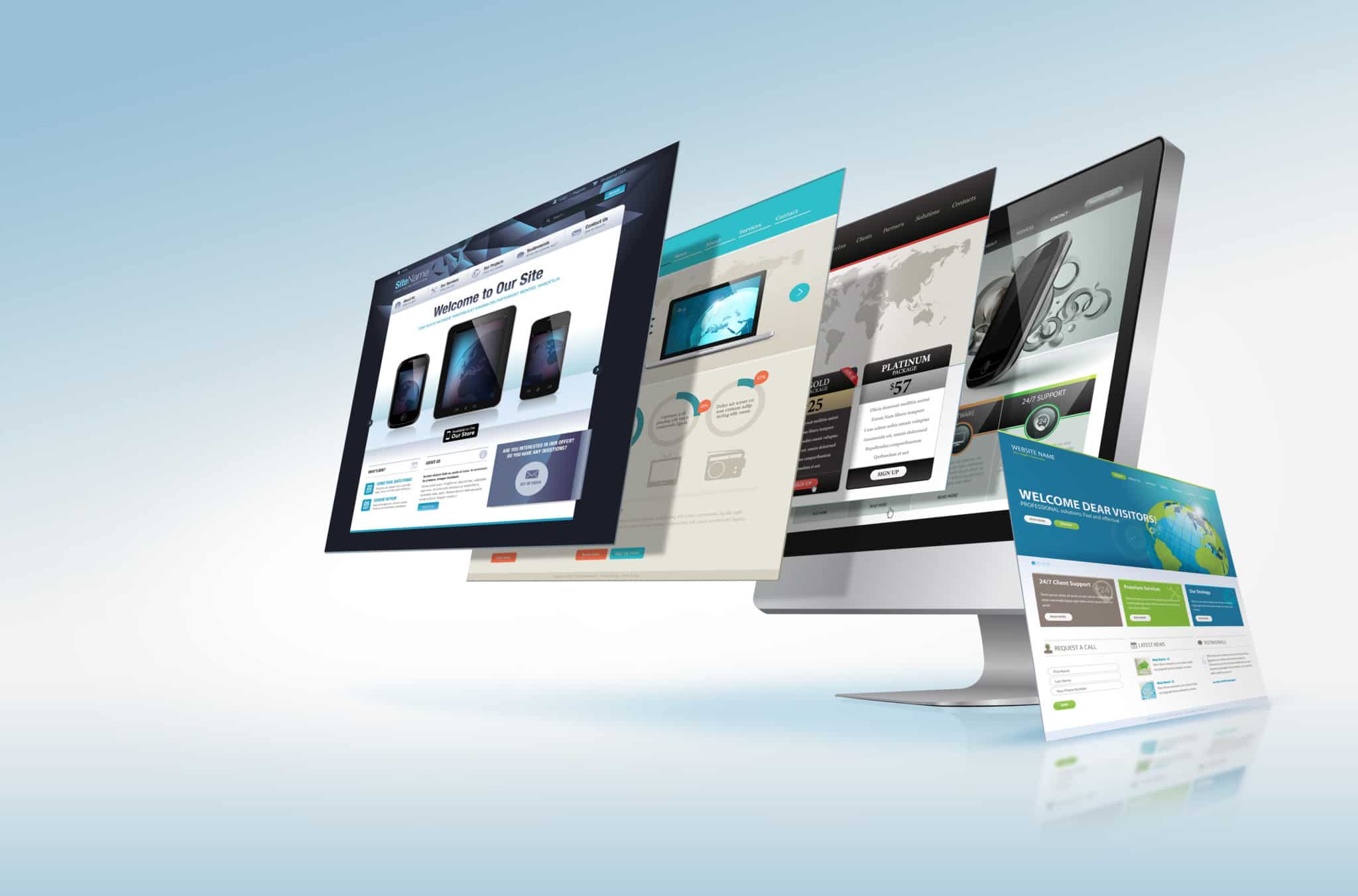
What a Feeling: 4 Design Tricks to Affect Emotion and Engagement
Think about what happens when you are browsing content online. As humans, we innately respond to content that moves us on a deeper level. From voicing our opinions on popular topics to sharing the articles, video and graphics that resonate with us, a large part of the human experience now takes place directly on the Internet. If you own your own website, you know first hand how hard it is to drive traffic your way and keep users engaged. However, websites that were once built based on really boring technical or functional aspects are now being upgraded into experiences that solicit a real response from users. Let’s take a look at 4 ways you can use design to improve user experience, incite emotion and foster engagement on your website.
Design Trick #1: Scroll With It, Baby
We are visual creatures and that means that we respond and react most quickly to information that is taken in by the sense of sight. One design trend that can help kick things up a notch is the use of parallax scrolling. In this technique, background images on your webpage move more slowly than those in the foreground. The effect gives your page incredible depth and dimension, a more refined look and the subtlety of this effect can immensely help lay out content and information in a more cohesive manner. The effect can be seen on the websites of most major companies now and greatly improve the overall user experience. It will also keep more eyeballs entertained than other flat designs.
Design Trick #2: Be Animated.
What’s a great way to separate your website from the competition and help push your company’s branding? Pencils down. The answer is custom animation. The beauty of investing in a customized, animated image is that it gives you and your business a very important distinction that is so often lost in the business world—a personality—which is the very thing that makes us create emotional bonds to one and other. Think about it, Little Debbie, the Geico gecko, Mail Chimp, even the Starbucks mermaid all have not only made their respective businesses immediately recognizable, they have also given them a tangible personality. This trick is an amazing way to appeal to a user’s sense of humor while helping make your brand instantly recognizable, so don’t be afraid to play around and give it a try. After all, every idea begins randomly in someone’s sketchbook.
Design Trick #3: Simplify, simplify, simplify.
Perhaps one of the most common design trends in recent years is minimalism. We may have just mentioned using custom animation and it’s a terrific idea, but please stop short of having your website look like it belongs in a “Where’s Waldo” book. Nothing turns people off more than sensory overkill and by tricking out your site too much, you run the risk of losing visitors before they have seen what you have to offer. Emotionally, people respond best to simplicity and order. Take Apple, Inc. for example. From its website to its stores, the creative team at Apple does not allow the user experience to be tainted by fluff. When your site is laid out in a simple, easy to use way visitors will be more inclined to explore its pages. An added bonus is that a minimalist design can also make your organization seem infinitely more confident and sophisticated because, after all, when you’ve got it, you’ve got it.
Design Trick #4: Keep ‘em entertained.
Finally, it is important to remember that people may visit your site, but that is not enough. You want to try to keep them there. Whatever your business, your webpage is more than a menu at the Long John Silver’s. Don’t just slap a list of services up and call it a day. A great way to retain visitors and solicit a positive emotional response is to make interactivity a focus on your webpages. Try implementing movable parts, hover effects or roll-over animations or be clever with how you display content. Giving users the ability to click, move, show or hide what they want to see will not only empower visitors to take control of their own experience, it will also keep even the most fickle of guests perusing your offerings much longer.


